︎︎ ︎︎
︎ Information
︎ Resume
︎ Poster Central
Tiffany Chu
(she/her) is an interdisciplinary designer whose work considers the screen and the page as a space for interaction and intimacy to collide.︎︎ ︎︎
︎︎ ︎︎
Tiffany Chu
(she/her) is an interdisciplinary designer whose work considers the screen and the page as a space for interaction and intimacy to collide.︎︎ ︎︎
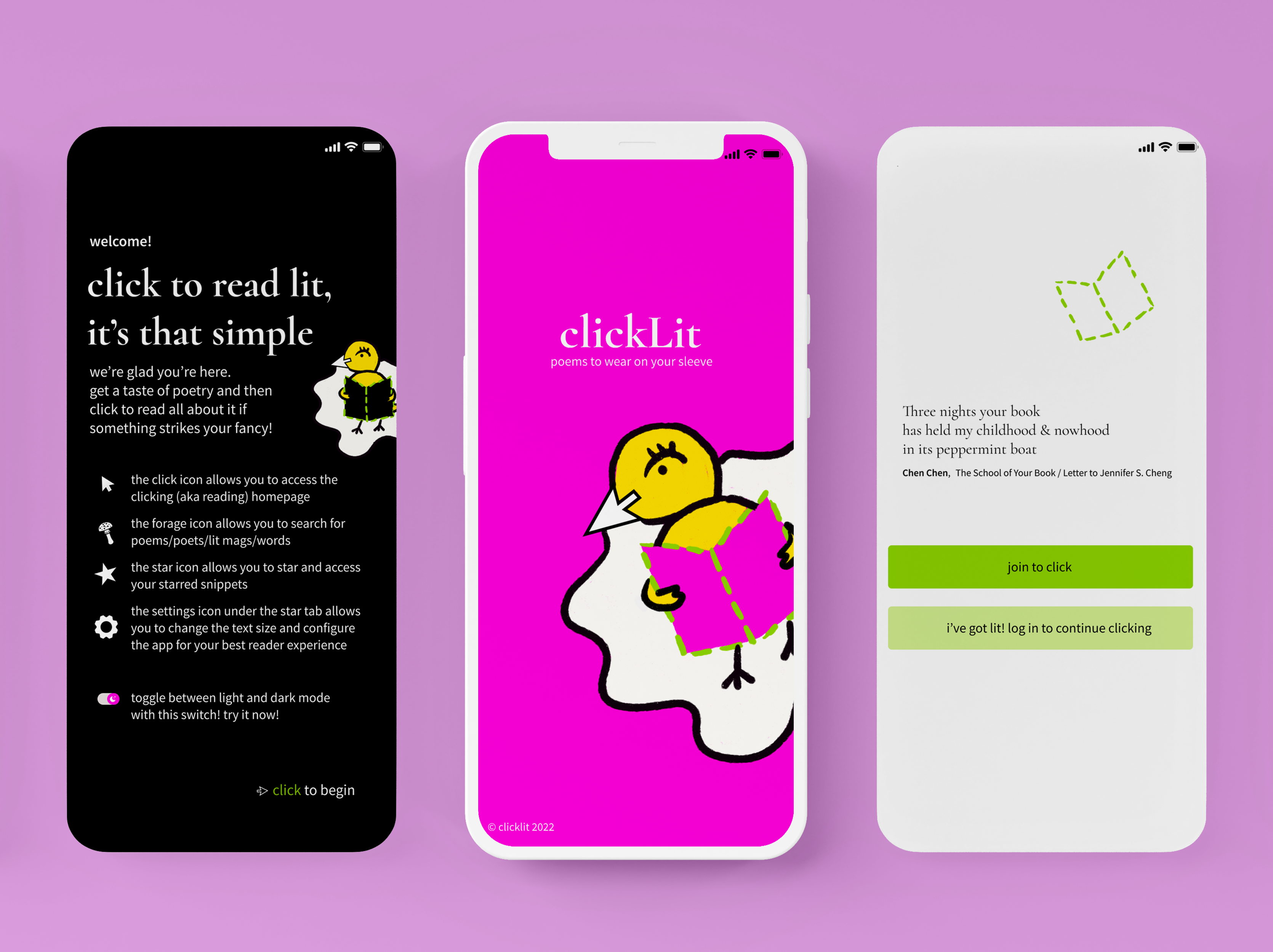


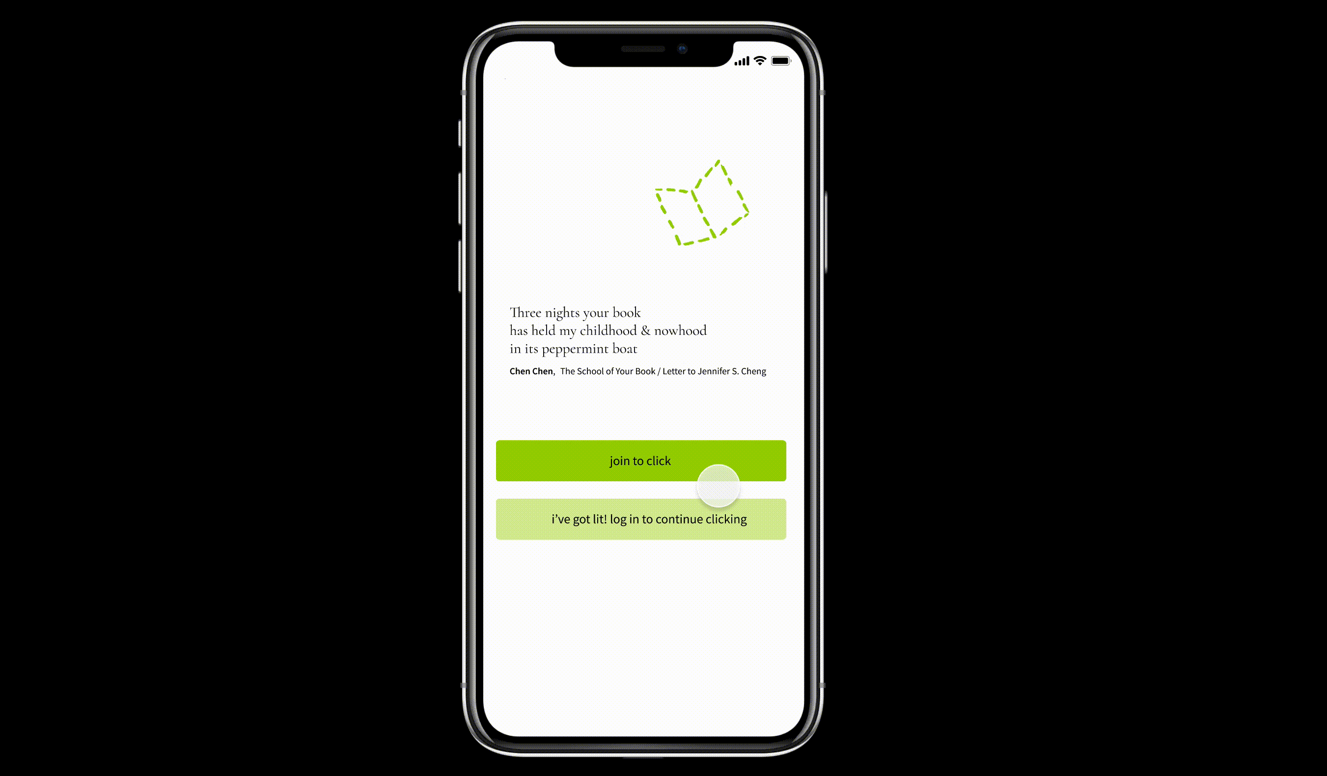
clickLit ︎
literature at a click « 2021
︎ UX/UI Design, Mobile Product Design
My Role: Research, branding, design, and prototyping
Programs Used: Adobe Illustrator, Photoshop, Figma
Collaborator: Mila Cuda (2018 West Coast Youth Poet Laurete, runner-up for National Youth Poet Laurete) came up with the name “clickLit” as a play on both chick lit (a genre of literature that is frequently dismissed on account of being “girly”) and the action of clicking to read literature.

Mila Cuda and I developed clickLit in response to a desire to create an accessible platform for users/readers to discover poetry through poets and poems that are closely relatable to them and usually marginalized.
In my fall semester review committee for my English Honores thesis on the use of the word “thing(s)” in literature, I was asked how I found the “coterie” of authors I was covering. Twitter poetry bots like @poclitbot and @queerlitbot are among my favorite and most frequented ways to discover new poems and poets. I’d pitched the idea of starting a Wellesley Review bot (@twreview_bot) for my college’s literary magazine because I believe these short snippets of lines of poetry are a brilliant way into reading poems and poets that are either emerging or not typically included in the literary canon.
Problem Statement: How we can make poetry by marginalized writers more accessible?
Why We Should Care: Primary and secondary school English curriculums in the United States still predominantly revolve around white cis-male heterosexual narratives and writers. For many students, poetry seems inaccessible and daunting because of the difficulty of relating to language written centuries ago and the privilleged identifies of most of the poets they encounter in school.
Research: We interviewed poetry enthusiasts about their experience of becoming interested in and excited about poetry. Through these interviews, we identified a common catalyzing moment of interest for the interviewees when they read a piece and realized “Oh! I didn’t know poetry could be this!” This realization of poetry as a relatable and amorphous medium rather than the stricter definition of the form as we were taught in schools was instrumental to sparking a new intrigue.
We identifed 3 personas:

We condensed my research into an empathy map to help me organize and identify pain points for users.
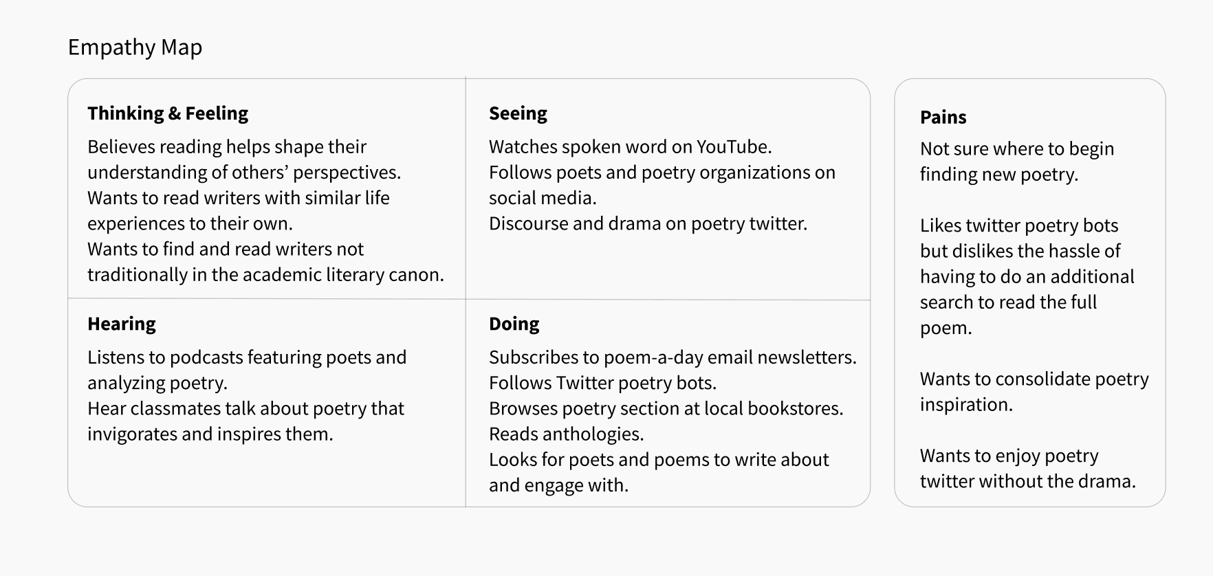
1. Poetry twitter bots are currently the closest options for consolidated online anthologies of writing. However, the character limit for Twitter means that users have to actively seek out the remainder of a poem to find its full context. The brief glimpse readers get within that character limit is great for finding new poems and poets, but as of now poetry bots do not accomodate delving deeper into a poem or a poet’s repertoire.
2. Discourse is frequent on twitter and readers want to be able to read without bumping into trolls.
3. Poets looking for new literary magazines to read or to submit to wish to be able to quickly access various literary magazines at once.
Product Decisions:
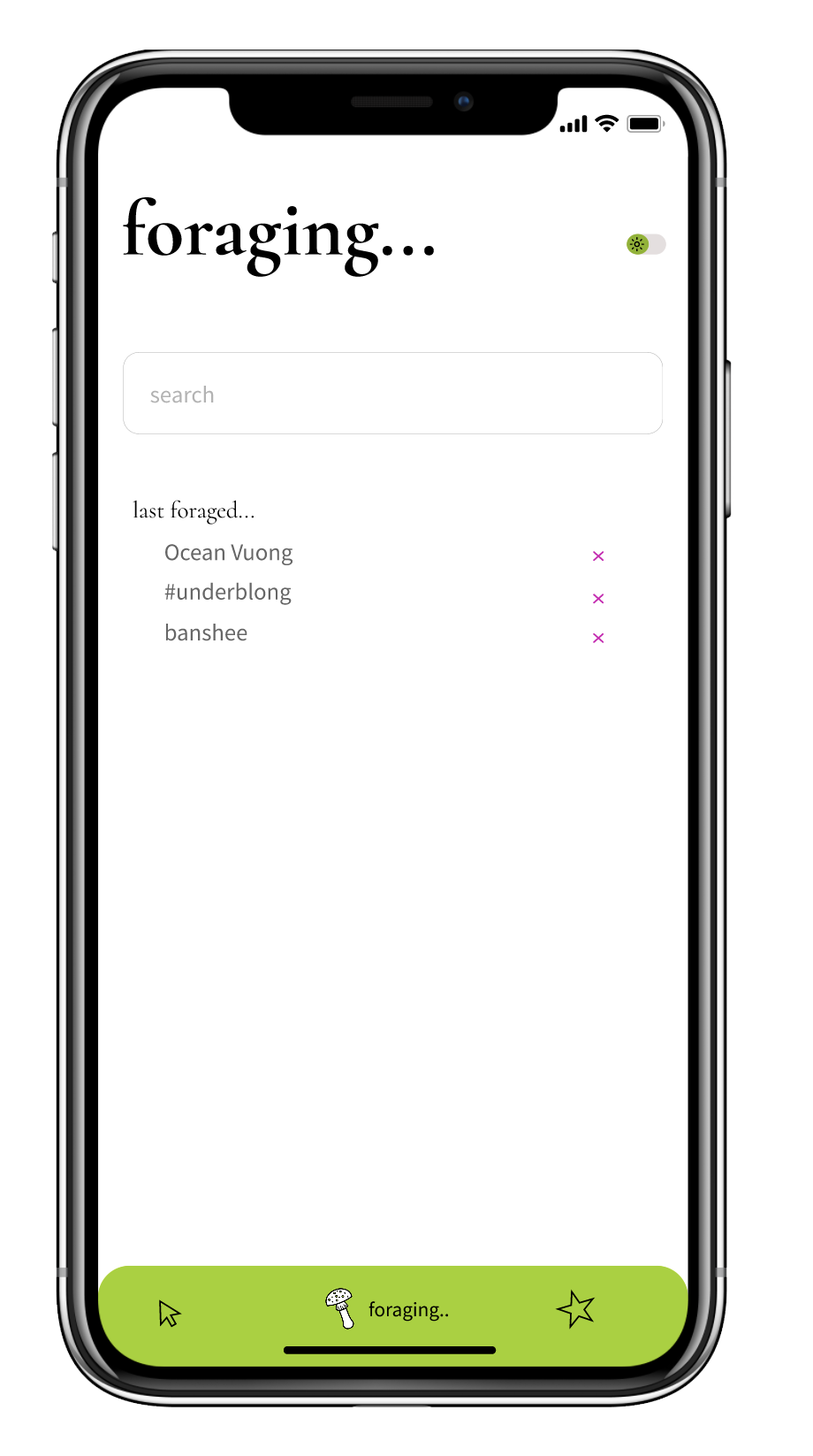
Based on our research I focused on three main features for clickLit: Clicking, Foraging, Starred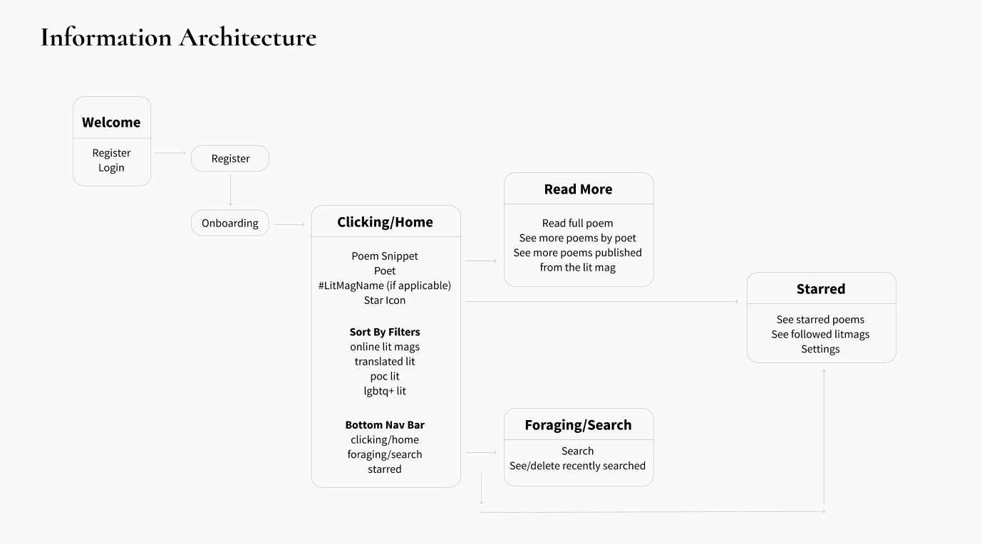
Low-Fidelity Wireframes:
Using Figma, I designed a low-fidelity wireframe to test two design strategies.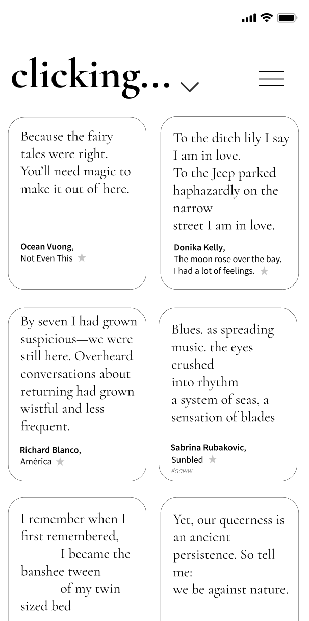
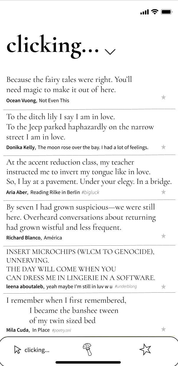
Scroll to Read with Bottom Menu Bar (Left) vs. Boxed Containers with Top Hamburger Menu
I interviewed and tested users to see which design style they responded more positively too and all felt that the scroll to read strategy was more familiar and easy to read as it closer resembled text-based social media platforms. They felt that the bottom menu bar that was always available was more accessible and quicker to use than the hamburger menu.
Style Guide:
Having settled on the scroll to read with bottom menu bar, I proceeed to define the visual elements.
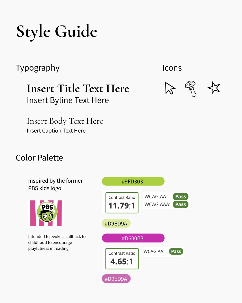
For the color palette, I was inspired by the former PBS kids logo. I wanted the visual aesthetic to be vaguely garrish as an encouragement to step outside of traditional “formal” stylicisms of poetry and dive into a childlike exploration of the words. The colors and icons I designated were a response to those impulses.
Beyond the aesthetic, I made sure that the background and foreground colors I chose had a contrast ratio of at least 4.5:1 according to Web Content Accessibility Guidelines (WCAG) to make the application as accessible as possible.
Beyond the aesthetic, I made sure that the background and foreground colors I chose had a contrast ratio of at least 4.5:1 according to Web Content Accessibility Guidelines (WCAG) to make the application as accessible as possible.
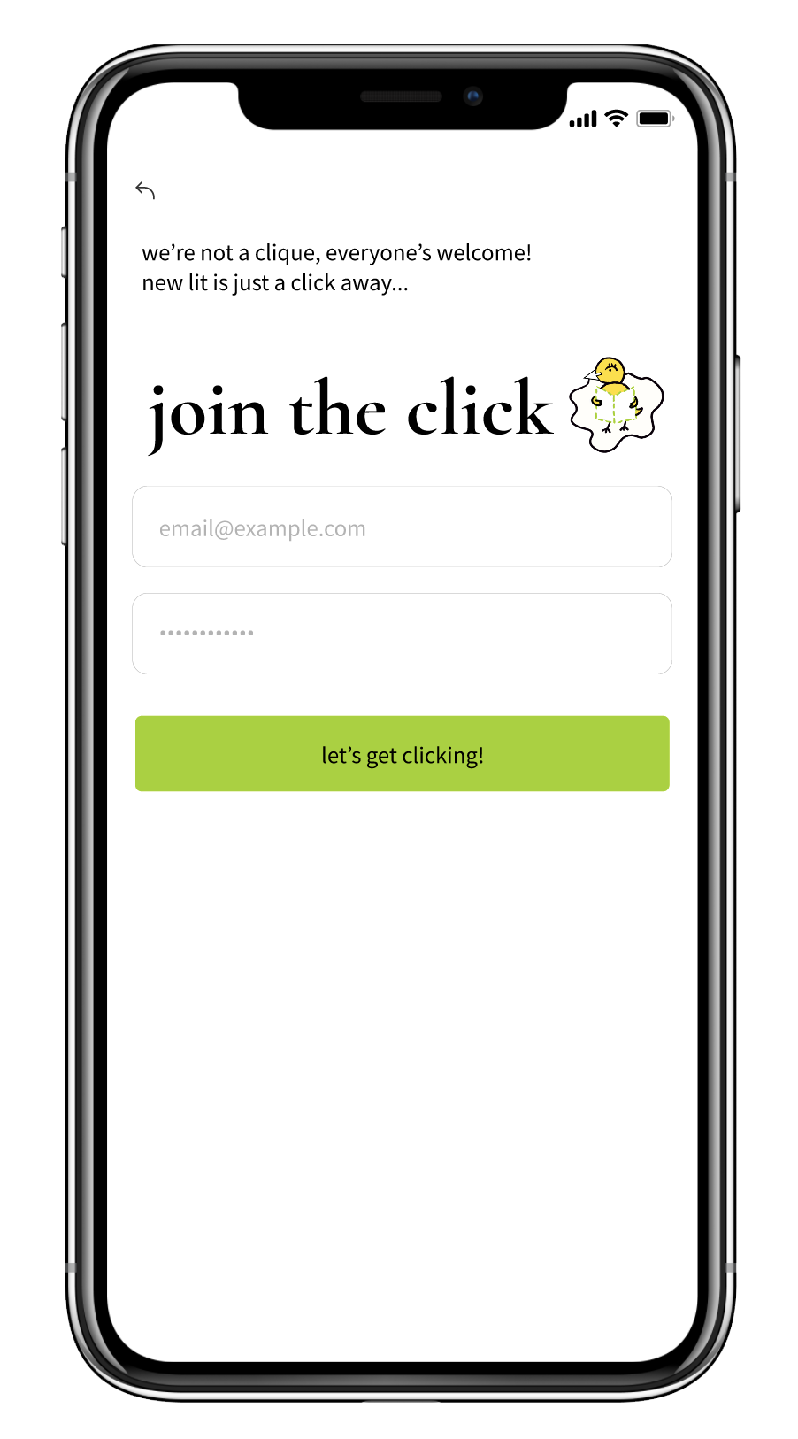
High-Fidelity Prototype
I designed the high-fidelity prototype in Figma, adding additional features like dark mode to ensure the reader can have a reading experience most well suited for their comfort.Onboarding:

Main Screens:

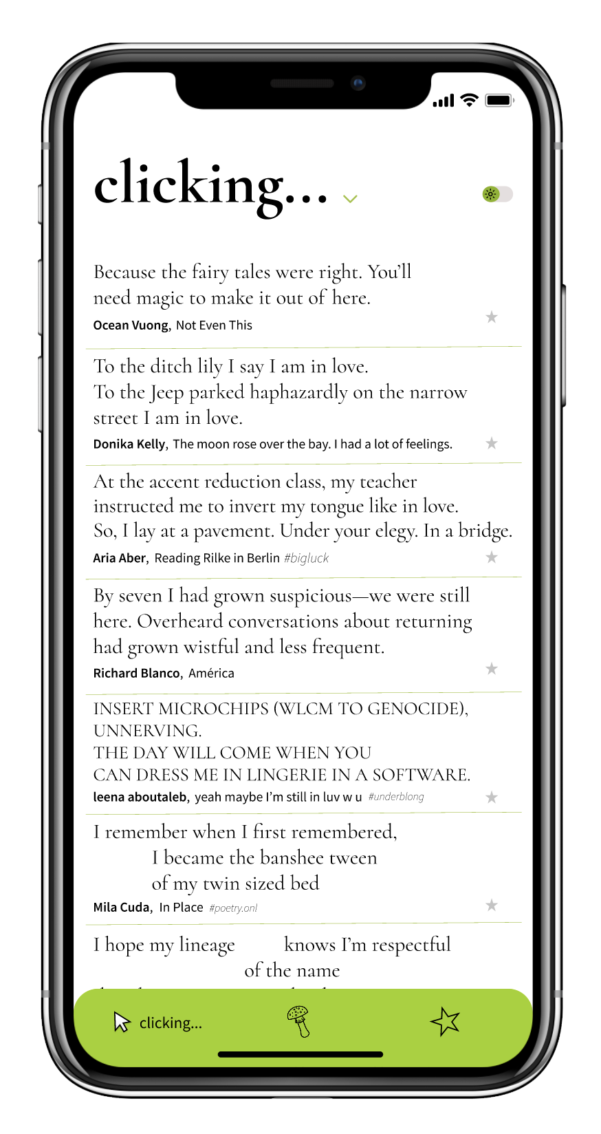

Features:
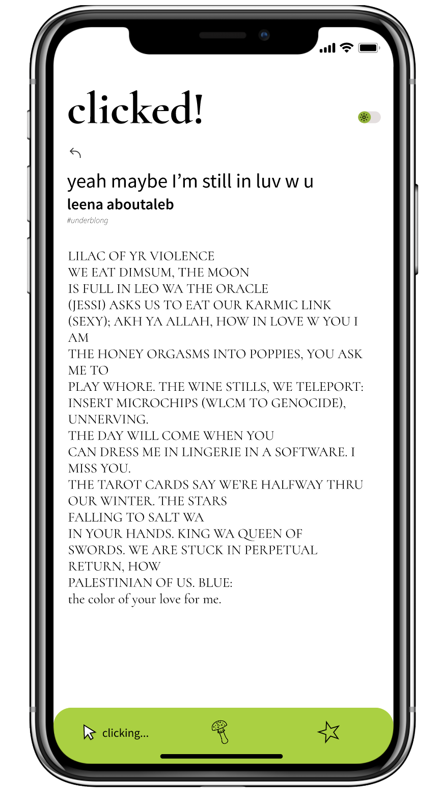
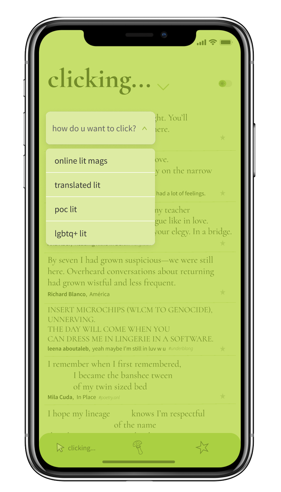
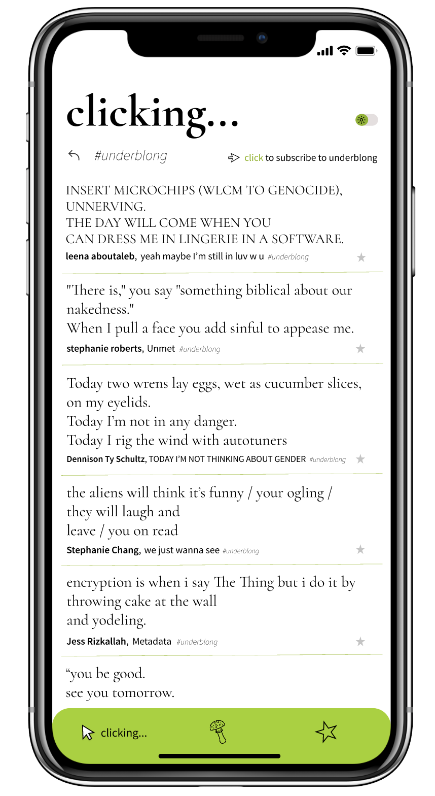
Clicking into a snippet of a poem from the “clicking” screen takes the user to the “clicked!” screen where they can read the full poem (left). Other ways to click include sorting through a single literary magazine’s hashtag (middle) to see what sort of content they publish or by categories (right).