︎︎ ︎︎
︎ Information
︎ Resume
︎ Poster Central
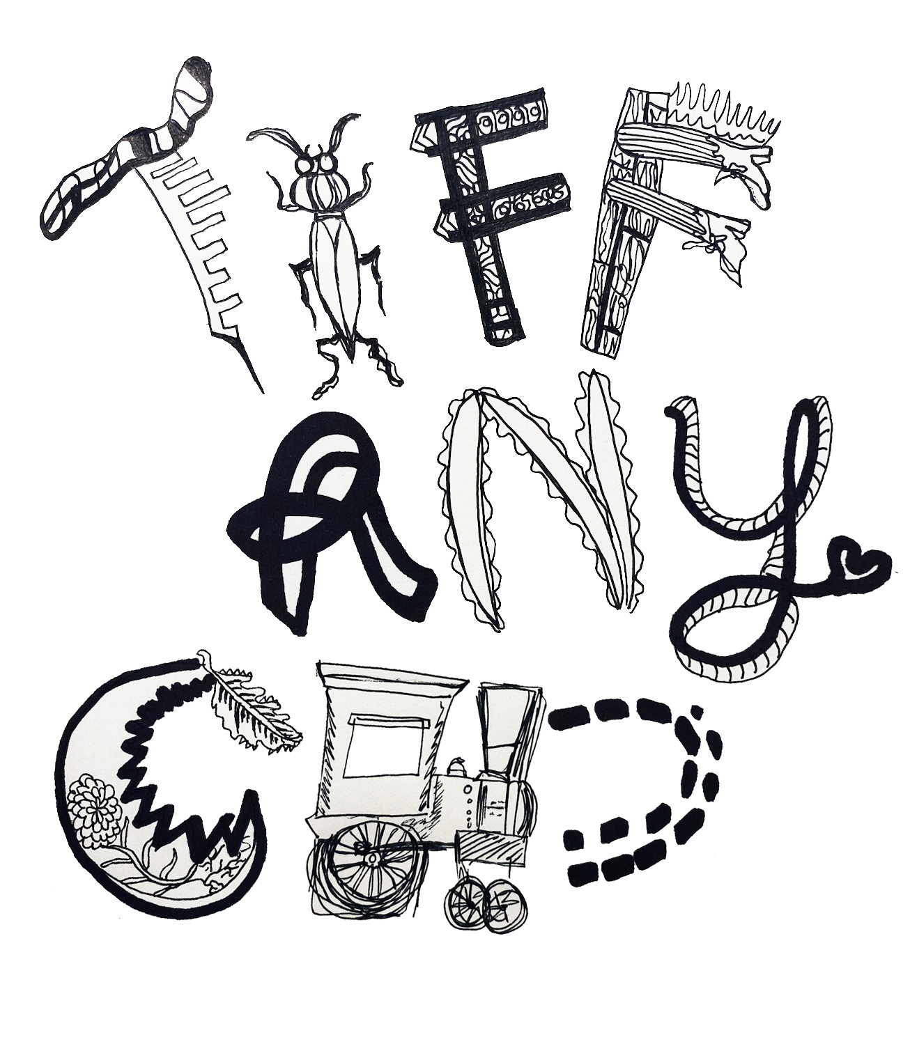
Tiffany Chu
(she/her) is an interdisciplinary designer whose work considers the screen and the page as a space for interaction and intimacy to collide.︎︎ ︎︎
︎︎ ︎︎
Tiffany Chu
(she/her) is an interdisciplinary designer whose work considers the screen and the page as a space for interaction and intimacy to collide.︎︎ ︎︎


The Isis Magazine at the University of Oxford ︎
Treehouse « Trinity 2021 Issue
︎ Print Design, Graphic Design
My Role: Creative Team & Social Media Team Director
Programs Used: Adobe Illustrator, InDesign, Photoshop, Trello
Editors: Nat Cheung & Kalli DockrilCreative Team: Bee Eveleigh-Evans, Liz Davies, Liv Fugger, Joseph Dobbyn, Liz Tiskina, Luca Thompson, Oliver Roberts, Grisel Jayapurna, Natalie Hytiroglou, Alisa Musatova
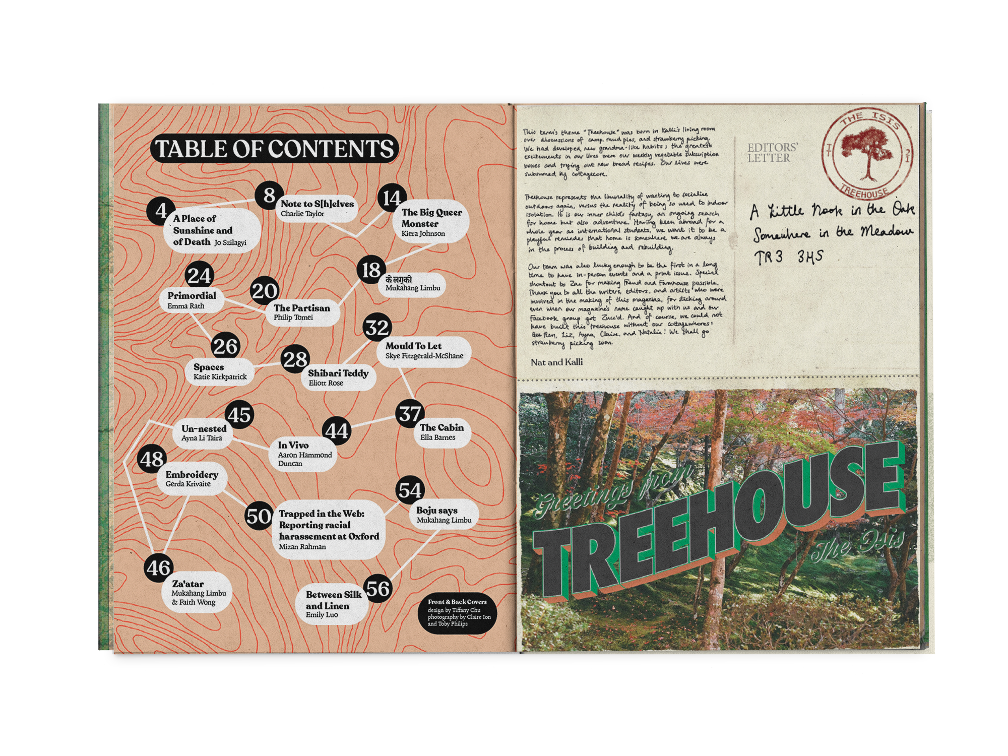
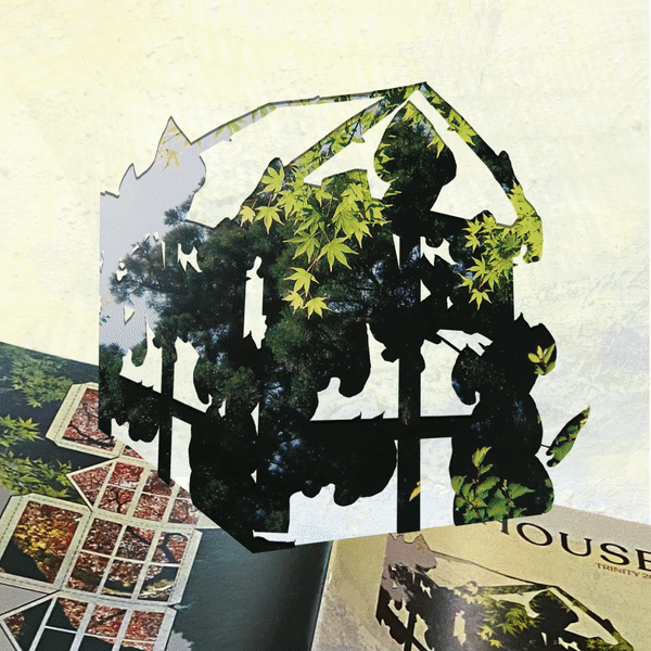
Established in 1892, the Isis Magazine is the longest-running independent student magazine in the UK. I conceptualized and designed the front and back covers for the spring 2021 issue, themed “Treehouse” as a call back to childhood play and in honor of Oxford’s abundant natural beauty. I also created editorial illustrations, designed select interior layout pages, and compiled/edited the final design file for the magazine.
Additionally, as the social media director for the term, I made graphics and infographics for the Isis Magazine’s Instagram.
 A scrolling infographic I illustrated and designed to accompany Sara Mashmi’s investigation into Oxford’s accomodation accessibility.
  Cover variations I pitched to the editors.
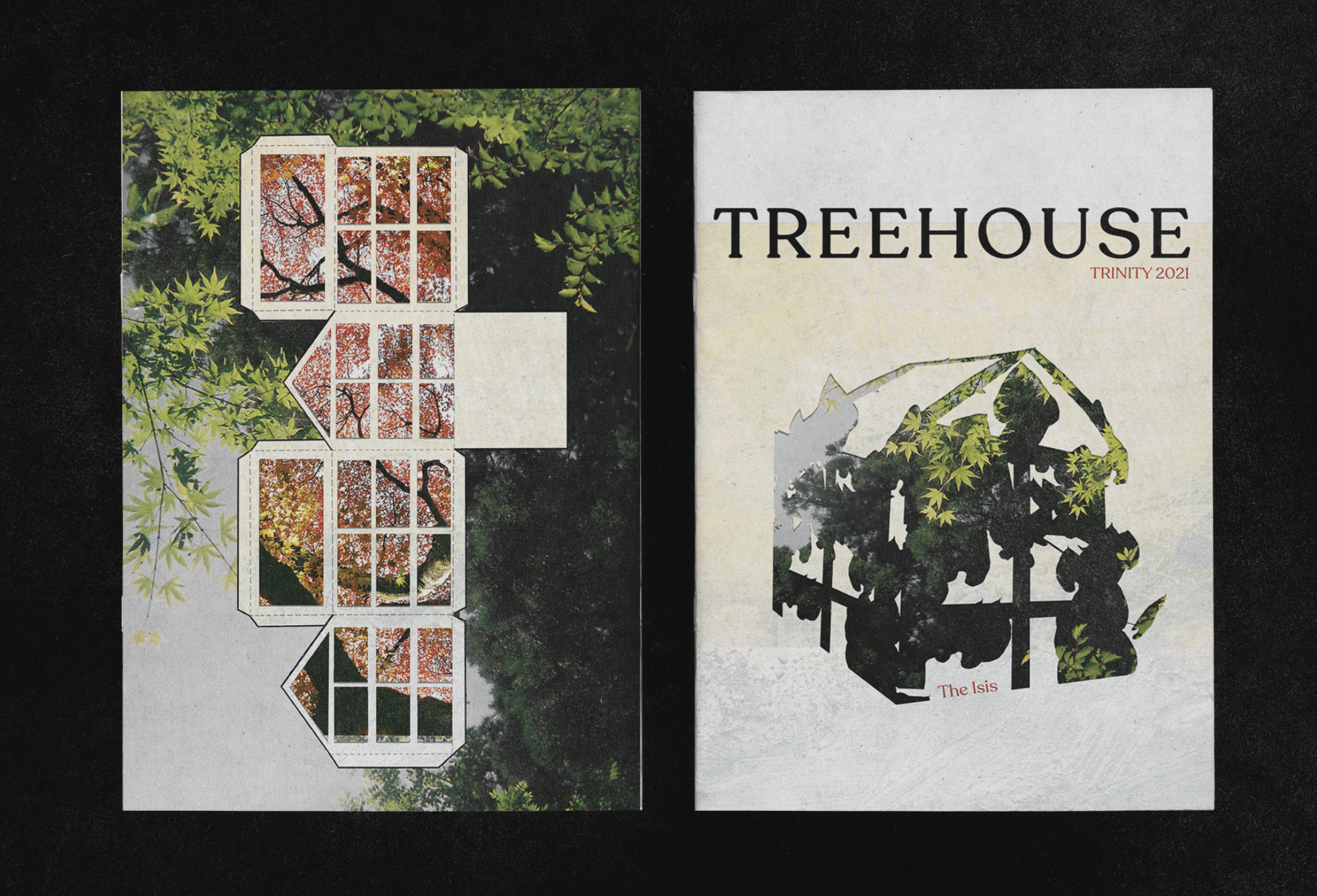
For the front cover, I was inspired by the idea of a tree house composed of leaves and woods rather than a literal treehouse. I took a horticulture class at Wellesley in spring 2020 and this picture (left bottom) I took of these massive leaves stuck with me. I intially edited the image to create the frame of the treehouse, but then combined this silhouette with this leafy picture (right bottom) taken by Claire Ion. I also edited Claire’s photo into a texture for the background of the front cover.

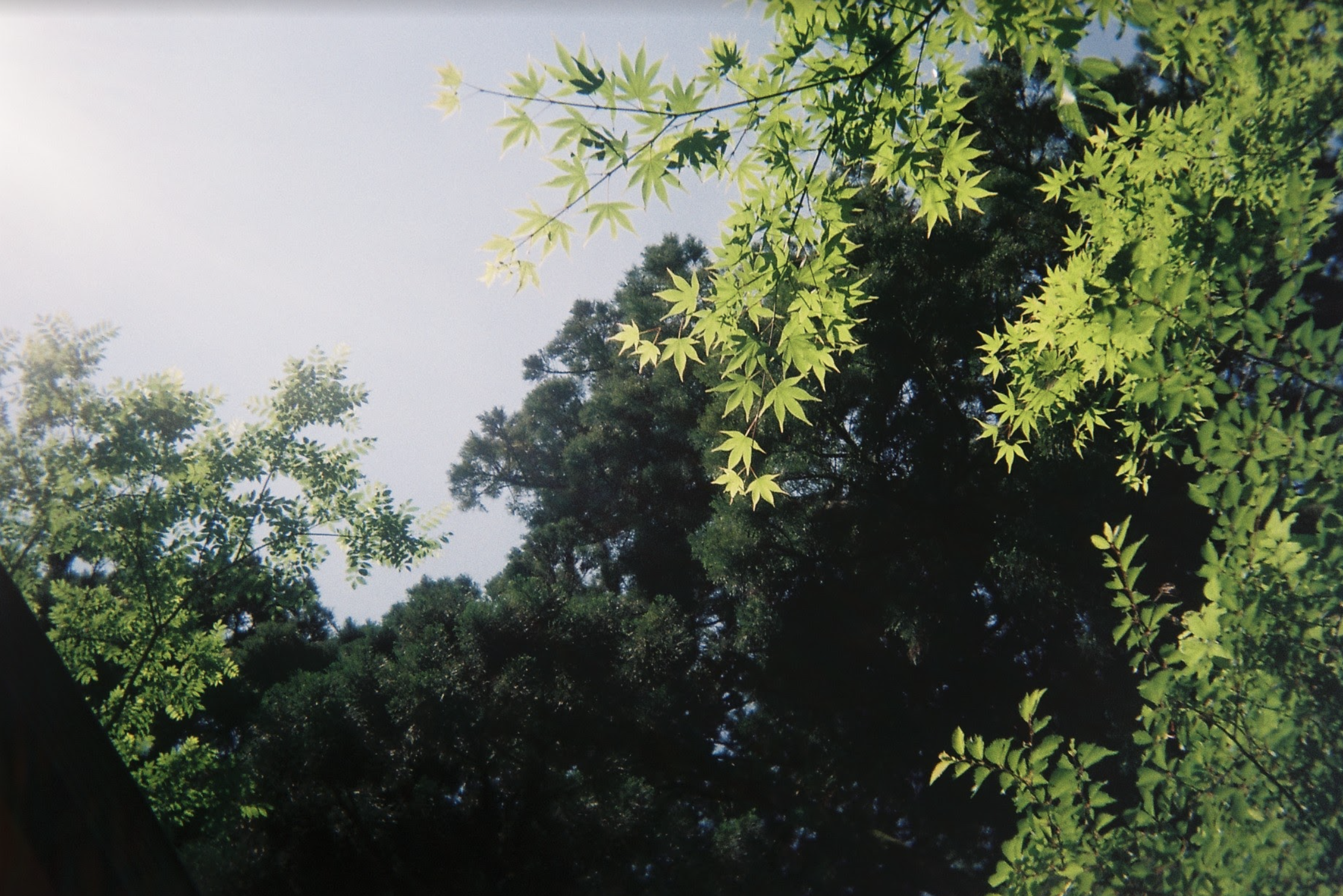
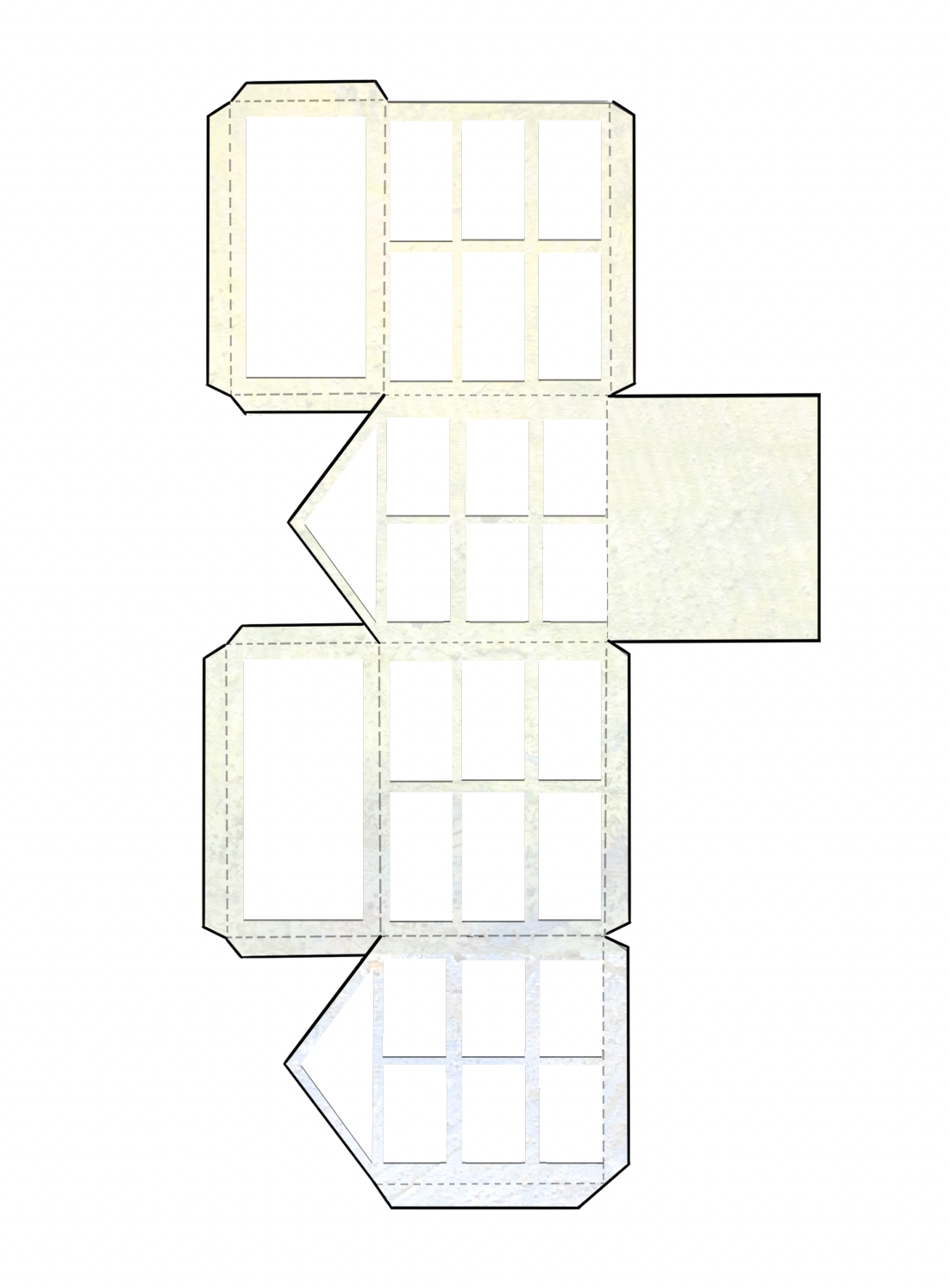
Drawing from the final front cover we settled on (pictured at the top of the page), the editors and I decided we wanted to create a template of a house one could theoretically cut out and build in the spirit of childhood play. I illustrated the cutout template and applied the edited version of Claire’s photo from the front cover for the frame of the house. Then, I inserted this photo of Japanese trees by Toby Phillips into the interior of the house. I reused Claire’s photo again for the background.

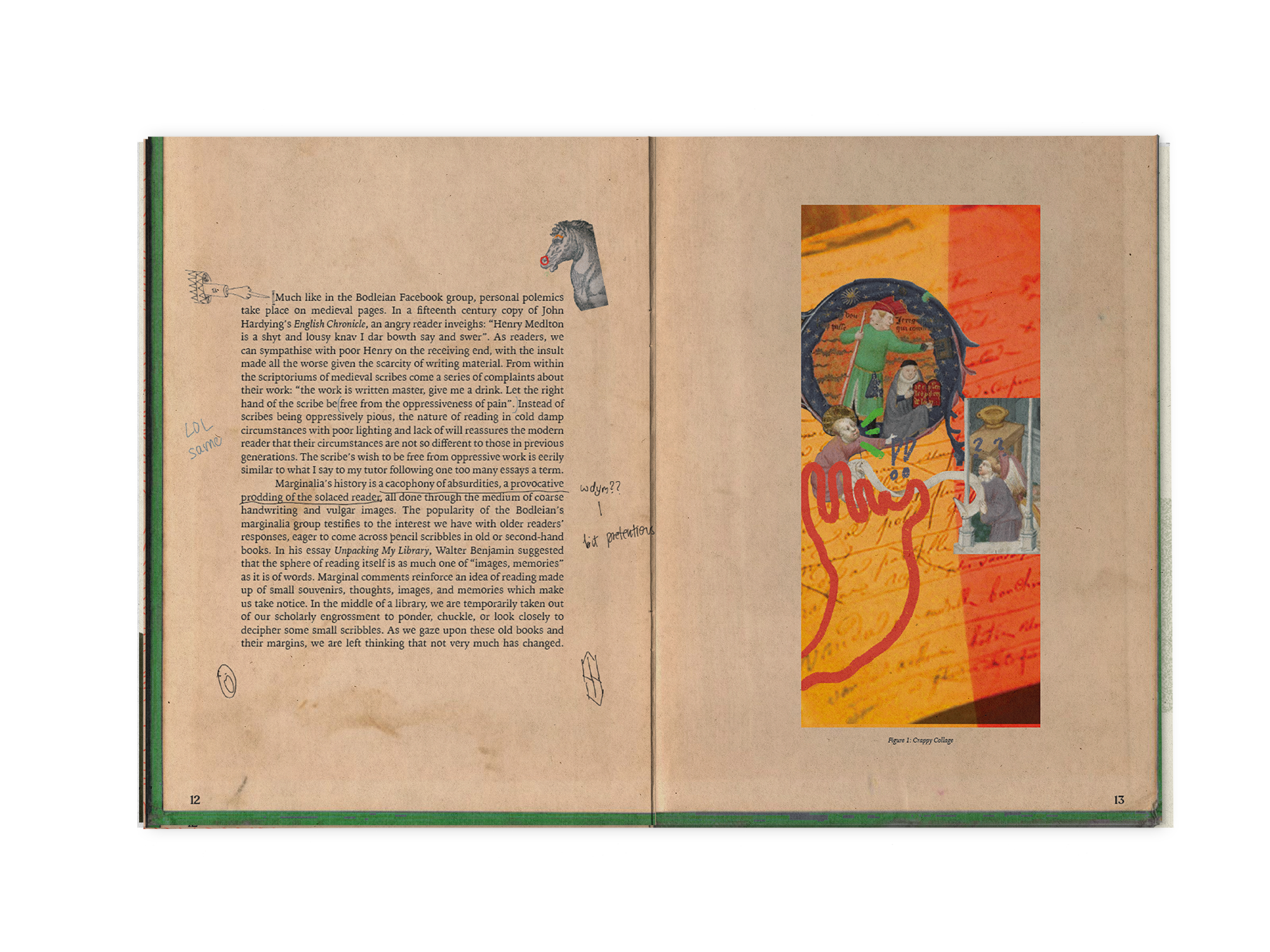
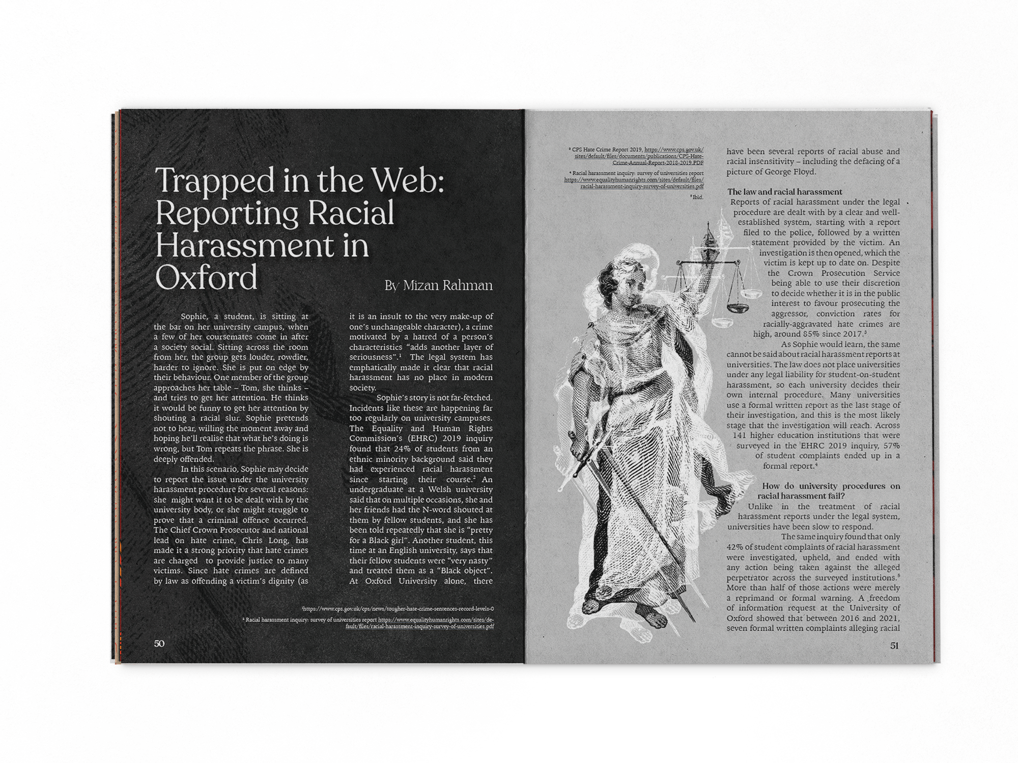
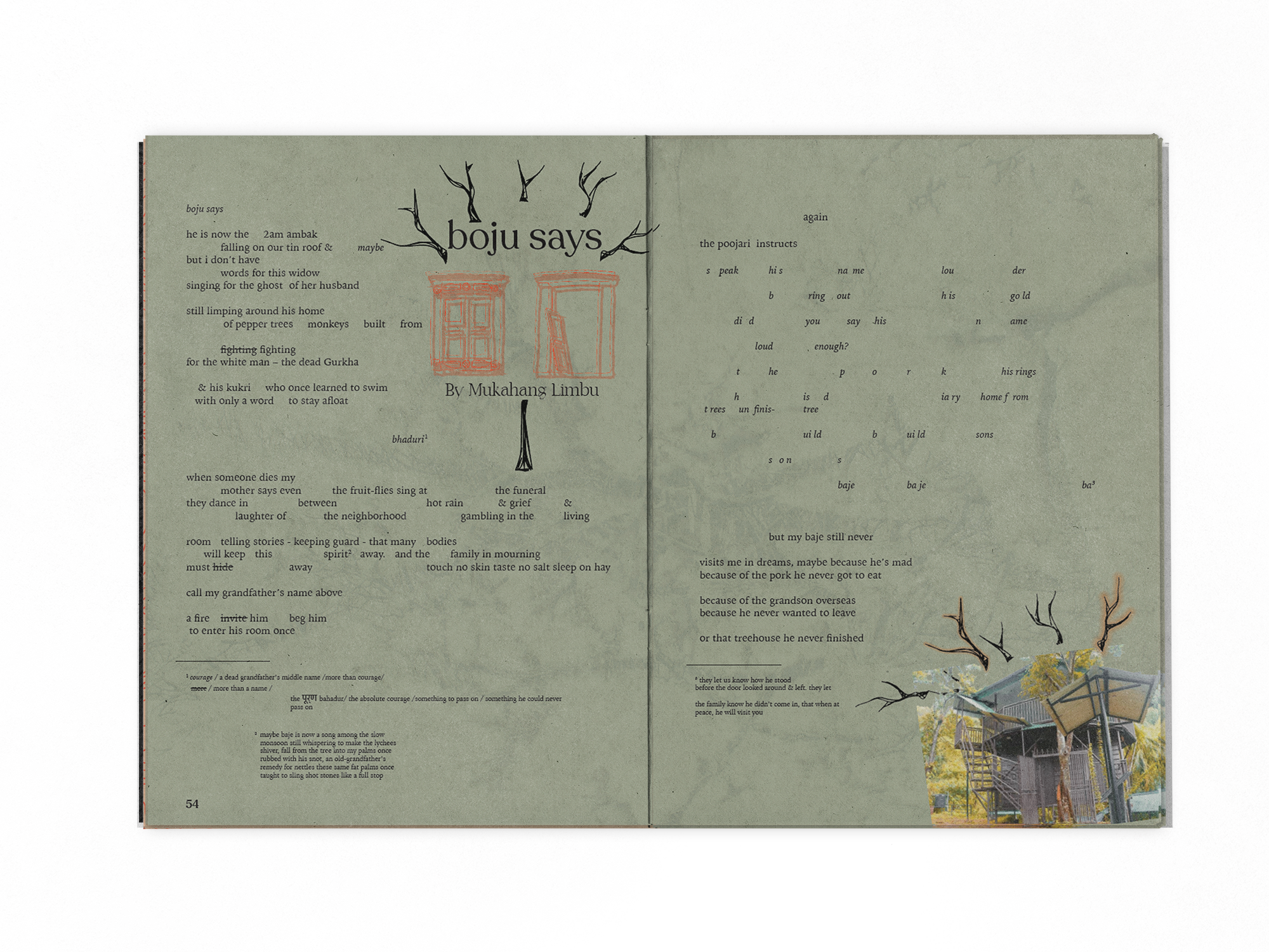
Some finished pages...


Additional graphics I made to promote the issue...

.